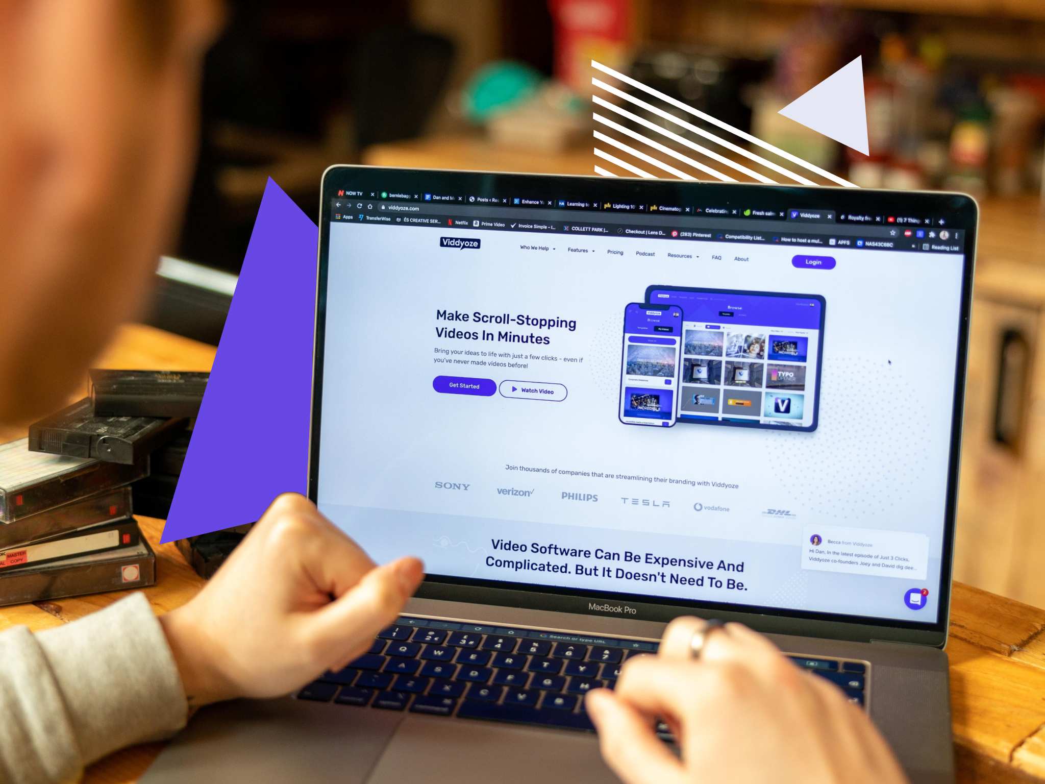
When our Facebook ads took off during the first lockdown in 2020, we saw significant conversion rates almost instantly. Why? Because we had an awesome landing page. This was no accident. We’d already been working on it for months, tweaking it constantly to ensure that the user journey, from the very first click on Facebook right through to checkout, was as painless as possible.
It took a lot of time and effort, but it was worth it – all that prep and graft paid off. And we still use that very same page today.
In this article we’re going to explain how we got to that point, the steps we took to build our landing page, and how having that in place in March 2020 helped us convert in such high numbers.
Lightening The Load
Our old landing page was very different. Structurally, it took as its inspiration the long-form sales letter, a much loved and effective direct marketing tactic. The aim back then was to capture traffic that came from joint-venture partners in the digital marketing space. It worked, but it was only sustainable for a set amount of time.
To grow and diversify as a business, we needed to shake things up
To grow and diversify as a business, we needed to shake things up. And during those now seemingly untroubled pre-pandemic days, we made the decision to branch out. To go universal.
That meant moving away from the approach taken by digital marketing websites. We liked what other SaaS companies – selling similar products – were doing. So we got to work and, of course, gave it a ‘Viddyoze twist’.
The outcome was a cleaner, more concise landing page that was much easier for cold traffic prospects coming in from paid ads to consume. It didn’t matter who you were or what you did. If you landed on this page, you’d see a video animation software solution that made sense to you. In other words, a win-win for all.
Variables And Split Testing
For us, the magic ingredients that made this landing page effective were the following key things:
- Price point
- Purchase
- Flow
- Check out (mobile and desktop)
- Headline
- Conversion widget
While they are all pretty much standard fare, they’re still essential. They’re all the elements that a healthy landing page needs to have to perform well. We didn’t reinvent the wheel – we just ran a few tests on it to see if there were any areas we could improve. Like the A-Team would. Or Iron Man. A wheel can always be improved.
When it comes to designing and optimizing a landing page, even the smallest of tweaks can have a huge impact on page performance
So, we started testing – a lot. To be clear, we started split testing, which is also often referred to as A/B testing. It’s a funny thing. Some of the changes we made (and still make) may seem quite minuscule – and they are.
That’s the beauty of it. When it comes to designing and optimizing a landing page, even the smallest of tweaks can have a huge impact on page performance – as you’ll see later on.
In terms of order, this is how it unfolded for us. Naturally, you don’t have to do it this way, but all we’ll say is this: start with your price point. It’s the most important variable. Once you’ve got that right, you can go any way you like.
Price Point
Viddyoze has two products: the Individual License, which currently retails at $97, and the Commercial License, which currently sells at $127. We were keen to offer prospects a great deal, while also testing an approach we had been thinking about.
That basically meant focusing on the Commercial License, which helped simplify things. And simple is always good when it comes to paid advertising. Now, because we were positioning the solution somewhat differently, we needed a new price point. To figure out what that would be, we had to test a couple of prices.
I had a theory that the market was being trained into that price point…
We’re not going to give away the exact numbers (we have to keep some things to ourselves!), but here’s the down-low. Let’s call them Price Y and Price Z. Price Z was the original price, so we left that one in there. For $Price Y, it was a bit of an informed guess from Nick Fielding, who heads up paid traffic at Viddyoze.
He’d noticed, for example, a lot of other video software products priced at around that figure. “I had a theory that the market was being trained into that price point,” he recalls. “I felt we might have some luck testing ours at the same price, too.”
Turns out he was right. After running the split test over a set period (10 days in this instance), Price Y won big. In fact, we saw 2.5 times the number of sales coming through at the cheaper price. This high volume of sales, plus the long-term value of the average Viddyoze subscriber, equaled a very healthy-looking profit margin. And we’ve never looked back. It’s the same price you’ll find on our Facebook ads to this very day.
Purchase Flow
This one was a surprise. The purchase flow is the journey a user takes from click to checkout. Most marketers try to get their prospective customers down the funnel as quickly as possible. The fewer the obstacles in the way of a sale, the better. Well, that’s the theory, anyway. But we had other ideas. In addition to the Commercial License, we decided to offer prospects some bonus material: $300 worth of training courses for free. We wanted to make sure customers didn’t miss out on this – there’s some super useful stuff in there – and to also understand exactly what it was they were getting.
So, we added an extra step. The landing page already had a nice, big, shiny button with “Get Viddyoze” emblazoned on it. Usually, a tap on this would lead you directly to checkout. Instead, we had our button scroll down to the bottom of the page where we explained our bonus offering.
Then we tested it: customers going straight to checkout (Test A) versus customers going via the extra step (Test B). The results were incredible. Better than we’d hoped. While Test A drove an enormous number of clicks to the checkout, the conversion rate was nothing in comparison to Test B. The extra step was a winner. While we were making our prospective customers work a little harder, it was still driving better conversion.
Checkout
Next up is the money maker. Needless to say, this bit needs to work pretty well. And there’s another thing you need to factor in: setting up different journeys for mobile and desktop. Which we did.
Originally, we had a one-page system with everything in one place, where all customer info, payment details were entered. This looked great on desktop but on mobile, it was a different story. It was overwhelming: too much information was being crammed onto a smaller screen. So, we decided to design a two-step system for both platforms. And, of course, we tested it!
Similar to purchase flow, most marketers would probably just go with the one-step approach. That’s understandable. And we get it. However, previous experience told us that a multi-step approach could work – but we wanted to be sure.
Interestingly, the split tests showed that while the one-step tactic worked better for desktop, the two-step method was the better option for mobile. The result is that today our mobile and desktop journeys are now respectively different from one another.
The moral? Test your audience and treat mobile and desktop as separate entities.
Headlines
Headlines, by design, need to be short and punchy. That means you’ve only got a handful of words to play with. It’s not easy, and even the smallest tweak can mean more or fewer sales. Choosing the right words, to say the least, is very important.
We were very wrong…
For our headline, we had two ideas: one that emphasized the result of using Viddyoze (e.g. Get More Eyes On Your Videos In Just 3 Clicks) and one that described what our software let people do (e.g. Breathtaking Animations In Only 3 Clicks).
We thought that by clearly demonstrating what our product could do for a prospective buyer, the headline would make Viddyoze more desirable and boost our conversion rate.
We were very wrong. Turns out that the headline ‘Get More Eyes On Your Videos In Just 3 Clicks’ received 16% fewer sales during the test than “Get More Eyes On Your Videos In Just 3 Clicks’.
Words matter. And it’s important that you take your time figuring out which ones work best for you.
The Conversion Widget
The final piece to our puzzle. If you’re not familiar with conversion widgets, they’re basically small pop-up boxes that appear every time a new purchase occurs. Something like this:
You get the picture. It adds a social element to the purchase flow in real-time. In theory, it makes the product more desirable. These widgets are usually sold alongside persuasive messaging about big conversion rates. We wanted to test that. So we opted for the Provely Widget.
We ran a split test of page performance, with and without the widget across desktop and mobile. For desktop, we found that it did indeed give us a bump in conversion. That wasn’t true for mobile. Meaning, for now, we only have a widget on desktop. That might change in the future – what doesn’t work now may well work in the future. after all. And vice-versa.
The Results
So, there you have it. That’s the process we went through to create our landing page, a landing that would ultimately serve us very well during the lockdown – and to this very day.
Every test we carried out to get there has been important. Sometimes the results were dramatic, like the price point test, which led to an increase in sales of over 168%. Sometimes they were a little more modest, like our headline test.
Taken as a whole, they’ve all played an important role in shaping what is a very successful landing page. And not just for us. Everything we’ve done has been with a view in mind to give the right customer the right offering at the right time. And, like any business, make a nice buck or two along the way, too.
This article is part of our What We Learnt Spending $1 Million On Paid Ads Over 30 Days series. Check out the others below (this will be continuously updated):
- There Will Always Be Buyers (Even In A Pandemic)
- How To Build An Awesome Landing Page That Converts
- How To Make a Facebook Video Advert That Actually Converts
- When It Comes To Paid Ads: Test, Test, Test
- Scaling Up: When Things Are Working, They’re Working For A Reason
- Building, Maintaining And Protecting You Brand Online
- The Importance Of Being Everywhere: Our Cross-Platform Ad Strategy
- Video Ads: Accept Things Will Break
- How To Generate Leads With Video Marketing [Complete Guide]


