")
For an online business, a landing page has one job: to get a visitor to carry out a specific action.
Here at Viddyoze, we know a thing or two about building landing pages that convert. We’ve built our business on our homepage, which is highly optimized to turn leads into sales.
In this blog post, we’re going to show you examples of landing pages that work and how you can apply this knowledge to your own website.
What Is A Landing Page?
A landing page is a purpose-built web page that a person lands on after clicking a link in an email, video ad, social post, or any other kind of digital marketing content.
The landing page is the part of your website that a visitor first makes contact with, meaning that as a potential customer, it’s their very first impression of the site.
Often, a landing page’s job is to convert a lead into a sale. However, there are many different types of landing pages, each with a slightly different purpose. Here are a few examples:
- Lead Generation page
- Lead Capture pages
- Sales landing page
- Pricing landing page
- Event page
- Long-Form page
- Unsubscription pages
- Conversion Focus pages
- Login page
What Makes A Good Landing Page?
To make a good landing page, there are some essential elements you need to include:
- Brand Consistency: When a person clicks on a link from a company, they expect where they land to have a similar look and feel to the rest of the website. Logos, color schemes, icons, and copy – these must all match to keep the customer journey visually consistent.
- Good Copy And Visuals: The copy, aka writing, should be clear, easy to understand, not filled with jargon, and persuasive for the purpose you wish it to serve, and the visuals should make sense. For example, if you’re selling a product, you’ll want a high-quality image of said product instead of something arbitrary. Selling a service? Try a clear animated explanation video of the service with subtitles to aid the visuals.
- An Easy And Page-Relative User Experience: The average person spends less than a minute on a landing page, so make it easy and fast for the user/visitor to get what they need. For example, on a sales landing page, don’t bury your “BUY” button at the bottom. Instead, position it so that it can be easily found within the first second of looking at your page.
- A Reason For Conversion: The user is interested, but why should they hand over their hard-earned cash? Your copy and branding needs to tell them why and be concise yet persuasive.
- Value In The Appropriate Places: An in-depth explainer video telling a user how to use your product is a valuable piece of content, but it’s not going to work on a click-through landing page. Make sure you’re placing the right content in the right place.
- A Wow Factor Or Fun Visual Element: Video always works well here, or you could consider custom icons if appropriate, polls, images, gifs, etc.
- Information Capture Form: if you’re looking to capture key data such as an email address or phone number, make sure to include a short form on your page where you ask for that data.
Now that you understand the basics of landing pages, we’re going to run through some awesome examples of the type of landing pages you can use on your website. We’ve also split the types of landing pages into sections to give you a clear idea of how each one is used.
The Types Of Landing Pages Everyone Needs
No matter what you’re selling, every website needs these types of landing pages.
Video Landing Pages
Video now accounts for more than 80% of all internet traffic. As a result, people have come to expect high-quality video content on most websites.
Not only do they expect it, but it also helps them convert (into sales). A video landing page can improve conversion by an average of 80%.
By having a fun visual representation of how your product works, instead of just telling potential customers, you’re more likely to gain trust and pull new leads into the sales funnel. Ever heard the saying “show, don’t tell”? That’s applicable here, and to make things simpler for you, Viddyoze has a free trial to help you auto-generate conversion-ready videos with ease and 0 experience.
For more tips on how to create a video landing page, check out our blog post, Marketing 101 Creating Your First Video.
Soft 404 Error
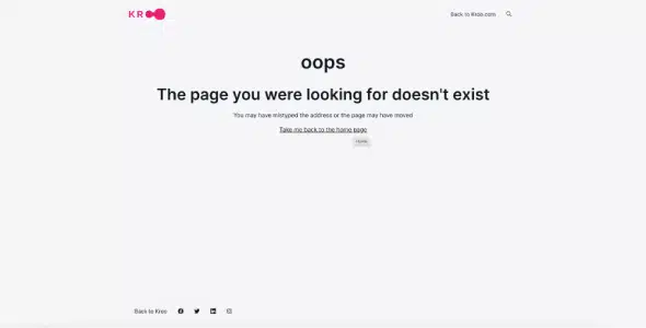
Sometimes, things will go wrong with your website.
But instead of showing the user the boring basic automated error page (a hard 404 error), give them a dose of your brand’s personality, like this example from Kroo.
This is effective for two reasons:
- It can add humor to a potentially annoying situation.
- It prompts the user to do something else with a link back to the home landing page.
You could also link to a similar product or to your social media channels – earn a new follower at the same time.
Contact
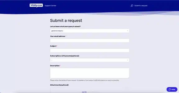
Whether you use a simple email form or a live chatbot, contact landing pages are absolutely essential to ensure good customer service.
After all, the majority, 64% of people want contact information to be readily available and easy to find.
This page is purely functional, as you can see from our example. The landing page design doesn’t need to persuade visitors to do anything, as they already have a reason to contact you.
The best contact web pages keep things clean, clear, and simple to use.
Meet The Team
Meet The Team landing pages give your business a human face, which is great for building trust and credibility.
Again, this type of landing page doesn’t have to reinvent the wheel. At the very least, it just needs to list your team members by name, with a small blurb about who they are, a job title, and what they do.
The example we’ve given here is a little more creative visually, but the end result is the same.
About Us
More proof that not all landing pages have to sell and convert. About us pages help a business build credibility and trust with its site visitors.
This is the place to tell people who you are. Generally, that means a brief company history and your company mission and values.
Some businesses also include information about the founders (although you can all put that on a “Meet The Team” page as well), and your head office’s location.
If you want to give your About Us an added boost, use a video to tell your story. You may be interested in the story behind Viddyoze, “From Broke To $30 Million”; this may give you some inspiration.
Landing Pages For eCommerce & Sales
Sales landing pages come in different shapes and sizes, but they all have one goal: to convert an interested customer. Here are the different types of landing pages you can use for eCommerce.
Product Detail Landing Page
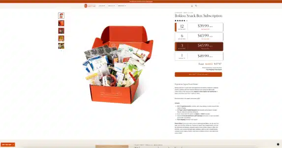
(Bokksu.com Product Detail Page)
These pages tell a customer everything they need to know about your product, sometimes in great detail.
Often, they use strong images and copy to get the point across, and depending on the type of product, these landing pages hold the kind of factual information a buyer needs to make a purchase. Strong copy is essential. As you can see from this example, the clearer the details, the better the user journey.
Recently, brands have also begun adding their Instagram feeds to their page. This is a nice visual addition, and, if you use real customers, as Bondi Sands has here, it also gives your products social proof – that’s the concept that consumers follow the behavior of others in relation to products.

Product Category Landing Page
While there’s nothing sexy about these landing pages, they perform a crucial function as the bridge between your homepage and your products.
You’ll see these types of landing pages on pretty much any commercial website. Whether they’re selling gym gear, flowers, dog toys, or hardware for home renovations, they all have it.
Essentially, these landing pages show all of a business’s products, either in a grid or ascending list, allowing the user to browse for the item they want.
Testimonial Page
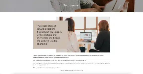
(Kate O’Neill Recruiting Testimonial Page)
Testimonials are used to get interested leads over the line to finally make that purchase by eliminating any final doubts that a person may have.
A testimonial can be written like in this example from Kate O’Neill Recruiting or in video format.
The best testimonials highlight how a product has helped somebody, using real-life stories, real images, and the names of the customers. When done right, they tend to help build trust for brands. In fact, two-thirds of people claim they’re more likely to make a purchase after they have watched a testimonial video.
A testimonial page is simply a place to host all of your testimonials.
Upsell Page
Whilst not technically a landing page, upsell pages are a simple way to boost your revenue during the customer’s checkout journey.
It’s an intermediary page near the end of the buyer cycle, which provides the customer with a number of related products, prompting them to add the new items to their cart. You’ve already got one sale lined up in their cart, so why not see if you can squeeze a little more?
At worst, they decline and continue to make their original purchase. At best, they end up spending more with you. Win-win.
Thank You Page
Another one that isn’t really a landing page but one all e-commerce stores should have anyway. The Thank You page comes directly after a sale.
As the name suggests, this isn’t much more than a “Thank You For Buying” message to your new customer. Thank You pages are a nice way to show your appreciation and begin a customer retention cycle. That is the process of keeping your customer and turning them into a repeat buyer.
They are also a great place to show your customer similar products, products that complement their original purchase, or a thank-you discount for them to use in future purchases.
Landing Pages for Webinar / Events
The type of landing page used for promoting events. They usually contain a sign-up form that website visitors can use to obtain tickets.
Event Landing Page
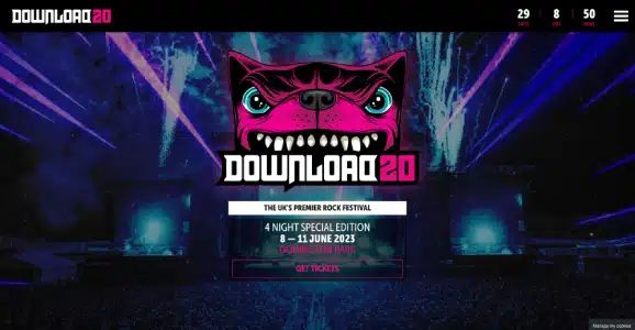
(Download Festival Event Landing Page)
An event landing page is a type of splash landing page (more on those below) used specifically for events, such as conferences, webinars, sales, or promotions.
The best splash landing events pages compel the user to act immediately, be that through a registration or a ticket purchase.
The example we’ve used is for the iconic metal festival Download. You’ll notice there’s not a ton of information on this page. There are two reasons for this:
1) The person landing on this page already knows about Download, and they’re ready to buy tickets.
2) The person has been directed here from another piece of marketing content (an email, a social post, or a banner ad), and they’ve already been persuaded to buy a ticket.
As a result, all you need here is the date, the location, the logo, and a big “BUY TICKETS” button. Of course, this will vary depending on the event, but as the old adage goes, less is definitely more on an event splash page.
Often, you’ll see these types of landing pages use a timer visual, counting down to the event’s date. This is an old-school marketing trick used to create hype and excitement and drive more sales.
Registration Landing Page
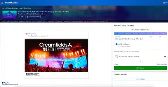
(Creamfields Registration Page)
A registration landing page is similar to an event page. It allows people to register for something, in this case, a dance festival, before the tickets go on sale.
For businesses, it’s also a way to obtain a person’s contact details. For example, a name, the user’s email address, and telephone number. Landing pages like this allow you to pull people into your marketing funnel. Even if they don’t buy a ticket, you’ll still be able to send them marketing communications.
Once again, these types of landing pages don’t need to be overly complex. A simple form where a person can input their data is more than enough.
Replay Page
Once you’ve hosted an online event, such as a webinar or conference, it makes sense to use the footage to create more content.
Create a dedicated landing page on your website where you can host it. Not only is this great for SEO (video results in Google have a 50x higher chance of being ranked organically compared to text), but it’s a great asset to promote across social media and through your email marketing.
Landing Pages for Lead Generation
Also known as a lead capture page, a lead generation landing page is used to acquire new customers or customer contact information.
A Squeeze Page
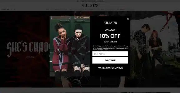
A squeeze page is an overlay or pop-up that appears over a landing page when a user first lands on a website.
For the most part, sales and marketing teams use squeeze pages to collect customer information, such as email addresses.
The best squeeze pages offer the user a deal or offer in order to encourage a sign-up. For example, 10% off the product you are marketing or a free piece of content (an e-book or online course) that relates to said product.
Be sure to include a catchy headline, strong call-to-action button, clear copy, and exit link in your squeeze page.
A Lead Magnet Page
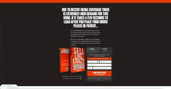
(Sell Like Crazy Lead Magnet Page)
A lead magnet landing page works just like a squeeze page, with one key difference – instead of an overlay, these lead capture landing pages are fixed pages designed to receive direct website traffic.
The key here is to offer something of value to your user base. In this example, Sell Like Crazy is giving away a free book about digital marketing. The author, who runs a digital marketing agency, is presumably collecting email addresses in order to promote other marketing services.
Your lead capture offer doesn’t have to be a physical product. It could be a piece of video content, an eBook, an exclusive interview, or access to a digital tool (for example, a calculator or a tracker).
Click-Through Landing Page
A click-through landing page is the warmup act for your checkout page. It bridges the gap between your marketing material, be it an ad or a social post, and the sale.
These types of landing pages are typically used for poor-quality leads who need a little more convincing. The main objective of a click-through landing page is to nudge a lead over the line. At this point, you really want to hammer home HOW your product will help.
Push the value of your proposition, pointing out the problems your product or service will solve. Let’s take Sell Like Crazy, from the previous point, as an example. The value is simple: this book will help the user win more customers.
The best click-through landing pages keep things simple. All this landing page type needs is a catchy headline, a few lines of persuasive copy, an engaging product image, and a button to take the user to the next stage of the funnel. Don’t waste time with a signup form – you don’t need that here.
Pre-launch Landing Page
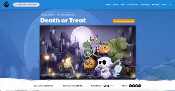
A pre-launch landing page is a brilliant way to create hype and excitement before you launch a product or event.
As the preferred landing page for a launch, these pages can be simple, such as the Death or Treat example here. Besides the teaser video and the “coming soon” banner, this page doesn’t prompt any action from the viewer. Alternatively, you can use the page to capture the date, like in this Zelda example.
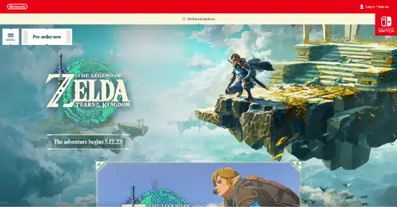
(The Legend of Zelda Tears Of The Kingdom Pre-launch Page)
Not only does a “pre-order” function earn money in advance, but it also captures valuable contact details, such as name, email address, and phone number, for your database. Create more excitement and include a countdown timer for your launch date.
Landing Pages for Affiliate Marketing
Landing pages for affiliates are designed to drive as many clicks as possible to a third-party site.
Product Review Landing Page
A product review landing page is a legitimate review of a product that an affiliate uses to drive clicks to a third-party site.
It can host written or video reviews. The only requirement is that the review be real and persuasive enough to send visitors through to the pricing page.
Product Comparison Landing Page
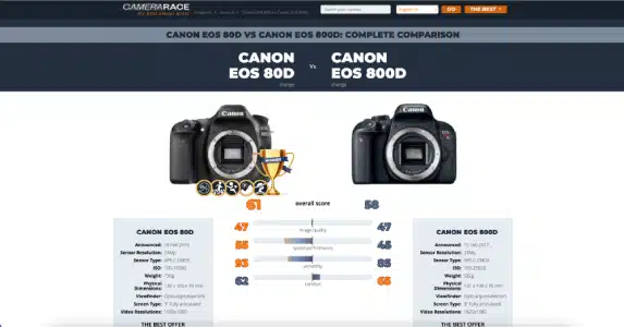
(Canon Cameras Product Comparison Page)
Before making a purchase online, most people (81%, to be exact) spend hours researching the product they’re interested in. Often, they’ll use a comparison landing page to help inform their decision.
These long-form landing pages compare two products, side by side, offering up the pros and cons of each. As you can see from this example, the details can be very granular, including weight, price, and other key specs.
Often, the affiliate will rate or score both products, providing links to both items for balance.
Declaration Page
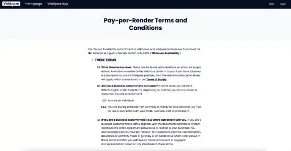
A declaration page is purely informative. It could be the details of a policy, such as the terms and conditions of your service.
There’s no action being pushed. A long-form landing page like this is mostly a legal concern, and it helps with customer complaints – you can always refer to this page should you need to.
Landing Pages for Apps
App landing pages are simple pages from which a user finds out more about your app or downloads it.
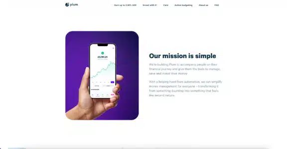
Download Page
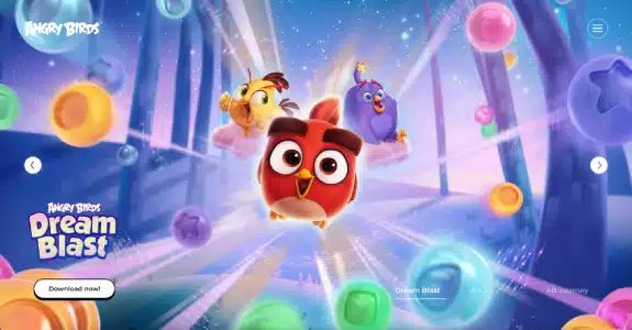
If a user lands on this page, there’s a good chance they’ve already made up their mind about downloading your app, as usually, these pages are for people who were already searching to download the app from a quick Google search.
As a result, this type of landing page doesn’t need any bells and whistles. Big, vibrant visuals, your logo, and a button which says “download now” should do the trick. The Angry Birds site is the perfect example of this. Alternatively, you can use a QR code, like Plum.
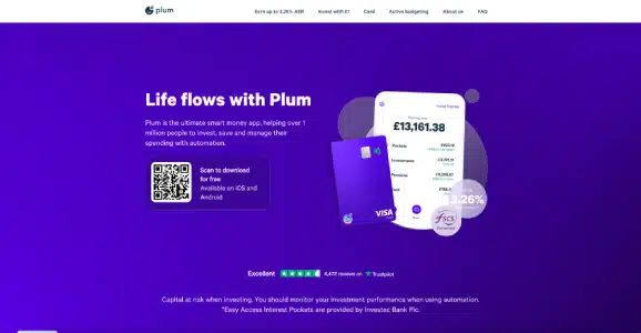
Whichever way you do it, make sure the journey links seamlessly to the App Store or Google Play.
Tutorials Page
There’s an old saying in sales: show, don’t tell, and you’ll sell more.
For a digital business, a tutorials page is a great way to action this advice. By creating a video landing page packed with useful content, you can show users exactly how your product works.
The page itself is just there to host a set of videos. What you put in these videos depends on your product. For example, if you have an app, you could create a series of tutorials that show existing customers using the app in real time.
Splash Page

A splash landing page is an introductory page welcome screen that a user sees when they land on your site. It’s usually the first thing they will see, so making a good impression is vital.
Splash pages are used to promote offers, provide disclaimers (for example, warnings or age verification), or offer language selection. As you can see from this Zara page, there’s very little copy in play. A good high-quality background image and some brief copy should do the trick.
The difference between a typical splash page and a squeeze landing page is that a splash page doesn’t ask customers to give up any personal details, such as an email. On the other hand, squeeze landing pages push site users further along the sales funnel.
Landing Pages for Contests
Contests require three different landing pages to be successful.
Countdown Page
We’ve mentioned countdowns a lot already, so you know their main goal is to build excitement. This type of landing page is just a placeholder, giving your contest a digital footprint before launch. For the most part, all it needs is a countdown clock and the name of your competition. Hype will do the rest.
Entry & Prize Information Page
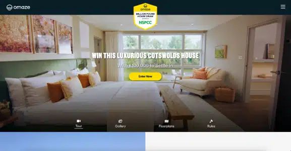
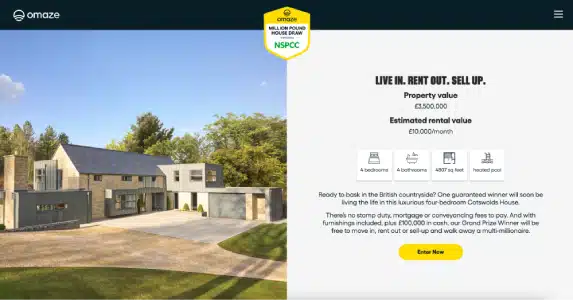
(Omaze Entry And Prize Information Page)
The prize is the centerpiece of any successful competition. The better you can make it look and sound, the more people will want to win it.
In this Omaze example, the prize is already spectacular – a house worth a million pounds (that’s roughly $1.2 million) pretty much sells itself. However, Omaze has found a way to elevate it even further using video.
Instead of a few high-quality images, Omaze has created a video walk-through, giving the viewer an irresistible look at what they could win.
In addition to the prize, you should include details of entry, including clear terms and conditions about the prize.
Winner Announcement Page
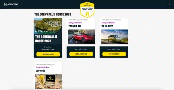
(Omaze Winner Announcement Page)
Sticking with Omaze, its winner page is super simple yet effective. Omaze uses a code that entrants can check against their own entry codes. Alternatively, you can use a static page that informs all entrants that the winner has been decided and asks them to check their inbox to see if they’ve won.
Landing Page Best Practices for High-Conversion
No matter what type of landing page you’re making, it has one job: to deliver on the reason for which it was created.
Whether you’re building a long-form sales page, a squeeze page, a lead capture page, or a contest winner’s page, your page needs to convert. By that, we mean your page needs to do its job.
The following 7 points will help you create a high-conversion page, no matter your marketing goal:
- 1. Ensure Visual Appeal: A page must look attractive and match your other marketing comms in terms of branding, tone of voice, and colors
- 2. Add Videos: 30% of the top-performing landing pages contain videos.
- 3. Multiple Call-To-Action Buttons: This is crucial for long-form sales landing pages – keep giving users a chance to convert.
- 4. Ensure Site Speed Optimizations Are Made: Use video facades to ensure that pages load quickly.
- 5. Utilize Z-structure: This type of page layout runs left to right, zigzagging from top to bottom, mimicking the human eye.
- Include Exit Intent Pop-ups: As a person tries to leave the page, offer them a deal or prompt via pop-up: Exit Intent Pop-Up Example
- Get Rid Of Unnecessary Steps: For example, keep any forms to one step as people like speed.
Final Thoughts On Landing Pages
Building a website takes strategy and planning. As we’ve explained, every landing page type – whether a lead capture landing page, a login landing page, an FAQ section, a sales page, or a pricing page – must have a dedicated purpose.
Done right, each page can achieve a high level of conversion, improving your chances of success. We’re not saying you need to create every page we’ve mentioned – only pages in the first section are a must. The rest you can choose from as you need them.
For more advice about how to optimize your website for conversion, check out this expert blog: CRO Strategies To Make Your Website More Effective.

